

Blog
Matte vs Satin Poster Paper: Which Finish Should You Choose?

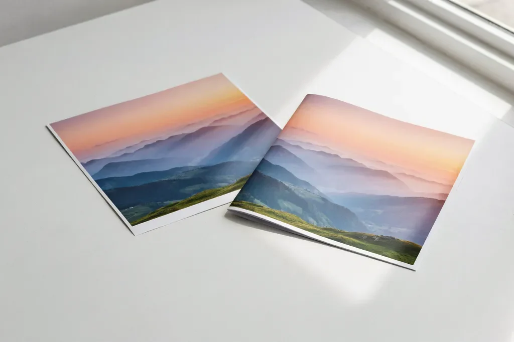
Quick answer: Choose matte if the poster is mostly text, will hang under bright lights or windows, or will be read from different angles, such as an academic poster or a school corridor poster. Choose satin if the poster is mostly photos or bold colour and you want a richer, slightly shiny finish. Both of our papers are 260gsm and cost the same.
The paper finish changes how a poster looks and how easy it is to read. This guide explains the difference between matte and satin poster paper, where each one works best, and how to choose for academic and school posters.
What is matte poster paper?
Matte paper has a flat, non-shiny surface. Light spreads out when it hits the paper instead of bouncing straight back, so there is very little glare. Colours look softer and more natural, and text stays sharp and easy to read from almost any angle.
What is satin poster paper?
Satin paper sits between matte and gloss. It has a soft sheen that makes colours look brighter and blacks look deeper, without the mirror-like shine of full gloss. Photos and images look more vivid on satin, but it can show some reflection under strong direct light.
Matte vs satin: side by side
| Matte | Satin | |
|---|---|---|
| Surface | Flat, no shine | Soft sheen |
| Glare | Very low | Low to medium under direct light |
| Colours | Natural and soft | Brighter, with deeper blacks |
| Text readability | Excellent from any angle | Very good, but can catch reflections |
| Photos and images | Good | Excellent |
| Fingerprints | Hides them well | May show them |
| Best for | Academic posters, text-heavy posters, bright rooms | Photo-led designs, colourful displays, framed posters |
| Weight (our paper) | 260gsm | 260gsm |
Which finish is best for an academic poster?
For most academic and conference posters, matte is the safer choice. Conference halls often have bright overhead lights, and visitors stand at different angles. On a matte poster, text, tables and graph labels stay readable without reflections. Matte also suits posters with lots of small text, such as methods and references.
Choose satin if your poster is built around images, for example microscopy, medical imaging, maps or photography, and you want those images to stand out. Satin can also look more polished if your poster will be framed or displayed long-term after the event.
Which finish is best for school posters?
For school corridors, classrooms and halls, matte is usually best. Schools often have large windows and strong lights, and pupils read posters while walking past. A matte finish keeps the message readable all day.
Satin works well for colourful, image-led posters in a reception area or display board, where you want the colours to pop. For example, a bold equality and social awareness poster in an entrance hall can look great on satin, while a text-led online safety poster in an ICT suite reads more easily on matte.
Does paper weight matter?
Yes. Paper weight is measured in gsm (grams per square metre). Standard office paper is about 80gsm. Our matte and satin poster papers are both 260gsm, which is thick enough to stay flat on a wall, resist creasing and handle being rolled for transport. Every poster is sent rolled in a protective tube.
Is satin the same as gloss?
No. Gloss has a high, mirror-like shine that can make posters hard to read under lights. Satin has a much softer sheen, so it keeps most of the colour boost of gloss with far less glare. That is why satin is often chosen for photos and display posters instead of full gloss.
How to choose in 30 seconds
- Mostly text, tables or graphs? Matte.
- Bright room, windows or spotlights? Matte.
- Mostly photos or bold colour? Satin.
- Going in a frame or on a display board? Satin.
- Still unsure? Matte is the most versatile choice.
Both finishes are available on every poster we print, from A4 at £9.99 to A0 at £39.99 for school posters. See our poster size guide to choose the right size, or our guide to making an academic poster if you are designing your own.
Frequently asked questions
Is matte or satin better for posters?
Matte is better for text-heavy posters and bright rooms because it has almost no glare. Satin is better for photo-led and colourful posters because it makes colours look richer.
Does satin paper reflect light?
Satin has a soft sheen, so it can show some reflection under strong direct light. It reflects far less than gloss paper.
Which paper finish is best for a scientific poster?
Matte suits most scientific posters because text and graphs stay readable from any angle under conference lighting. Choose satin if the poster relies on high-quality images.
What does 260gsm mean?
260gsm means the paper weighs 260 grams per square metre. It is more than three times as heavy as standard 80gsm office paper, so it feels thick, stays flat and resists creasing.
